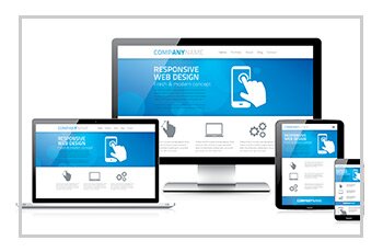
One website for all of your devices – it really is that simple.
Mobile and Tablet devices need to be more than a mere fleeting consideration to your website-browsing public. These devices are here to stay. Mobile traffic is expected to eclipse Desktop traffic in 2014, with most industries seeing in excess of 35% of total site traffic generated from mobile devices.
Responsive web design is the optimum way to serve your website in a consistent manner to users accessing your website on a multitude of devices, whilst also satisfying search engine requirements. What does this mean? Delivering your site’s content and media according to the device a user is utilizing is essential. Give a mobile user your desktop site, and they will hit the ‘back’ button immediately. Different devices demand different structures for navigation, display and content elements, so the site ‘fits’ each device.
How can I cater for all devices? With a Responsive Website design, we will build your site from the ground up. This means starting at the lowest resolution – the mobile website experience.
Why Responsive?
If you took every mobile and tablet device, as well as every desktop screen into account and added up all their different display resolutions, you’d have to design and build hundreds of websites to satisfy all those needs. Clearly, this is not practical, economical or even achievable in the real world. The solution: a responsive site architecture and design – a fluid layout which resizes ‘responsively’ based on your device’s resolution. A responsive site will always render the optimum website experience for any device.
What about Google?
Google and other search engines love responsive website design. In fact, Google and Bing state it is their ‘recommended configuration’ for building smart phone and tablet-optimised websites. The beauty of a responsive design is you are only ever using one set of data to power your website, whether viewed on a mobile, tablet or desktop device. This helps you avoid one of Google’s biggest ‘no-no’s’: Duplicate content!
To Google, this means the page only exists once (not as a page on your website, and another page on your mobile) and therefore is not being duplicated anywhere else. A responsive website keeps all desktop and mobile content running from a single URL, which makes it easier and quicker for Google to index it in their search results, and for users to share and link your content. It also makes great economic sense, as you only pay a single development cost to build a site serving all current and future devices.


